
I came across this article yesterday pointing out how Link had changed in design, many people argue it's still the same but anyone with a keen sense of detail can notice they aren't nearly the same anymore. Not only did they change the stands, the figures themselves seem to be lacking in the same quality they were initially shown off in.
As someone who was excited to start collecting some of these, I'm very sad to see Nintendo doing this and I don't understand why they would show ones that looked so much better before, but now look at lot cheaper closer to release. It doesn't seem fair that all retailers are still advertising the older higher quality designs still also.
If it isn't apparent to you with Link in the new video Nintendo had shown, then look at this, it's undeniable proof they are downgrading the quality of these figurines. Just like Link has changed, others have also taken pictures of different characters noticing the same decrease in quality. Now with Peach.
http://i.4cdn.org/v/1414270...
Look at the new design, are some of you people still going to act like they look the same? That is far from the same. First her face is awful now, the lips and eyes are so different from the first one.
Now look at the dress and all the details it had before, like her pendant is very defined in the first one, now look at how ugly it looks in the final design. Look at the gold in her dress before, how it was actually embedded on the sides and on the bottom before they painted it, now it is completely flat and no longer is embedded into the dress to give it extra detail and depth. The paint is clearly cheaper also, the older figure has this nice high quality shine to it that these newer figures don't, they seem dull now.
I know most people won't care but I just feel this shouldn't be acceptable, this is something you would see from a fast food restaurant, not Nintendo. These figures shouldn't be looking worse now than they did when Nintendo first showed them off to get people interested. For many people, like myself, that was the selling point, was seeing how well Nintendo actually made these figurines. Many people feared they would just look like cheap toys, so it was refreshing to see they didn't... Sadly, now they do.
Updated - I found more pictures of Link and he is definitely downgraded, he looks super cheap now. I found someone who took pictures of all of them at the EB expo recently.
First design Link -
http://www.damonx.com/wp-co...
Final design Link -
http://www.vooks.net/img/20...
First design Villager -
http://www.damonx.com/wp-co...
Final design Villager -
http://www.vooks.net/img/20...
You can view and compare the rest here, for those thinking the Peach image is a knock off or isn't real, they got a shot of the same downgraded Peach also. Notice the same flat gold on her dress, that was before of much nicer quality, that was embedded into the dress.
E3 2014 designs -
http://www.damonx.com/e3-20...
EB Expo 2014 designs -
http://www.vooks.net/ninten...
Microsoft announced its financial results for Q3 of fiscal year 2026, including an update on its gaming Xbox business and more.

Not looking good. Hopefully Asha Sharma is able to turn Phil’s disaster around.


To me it's still quite remarkable how they can cash-in 5.3bn in revenue in a single quarter, since their hardware is basically dead.

The charity event will be streamed live from Gamescom in August.
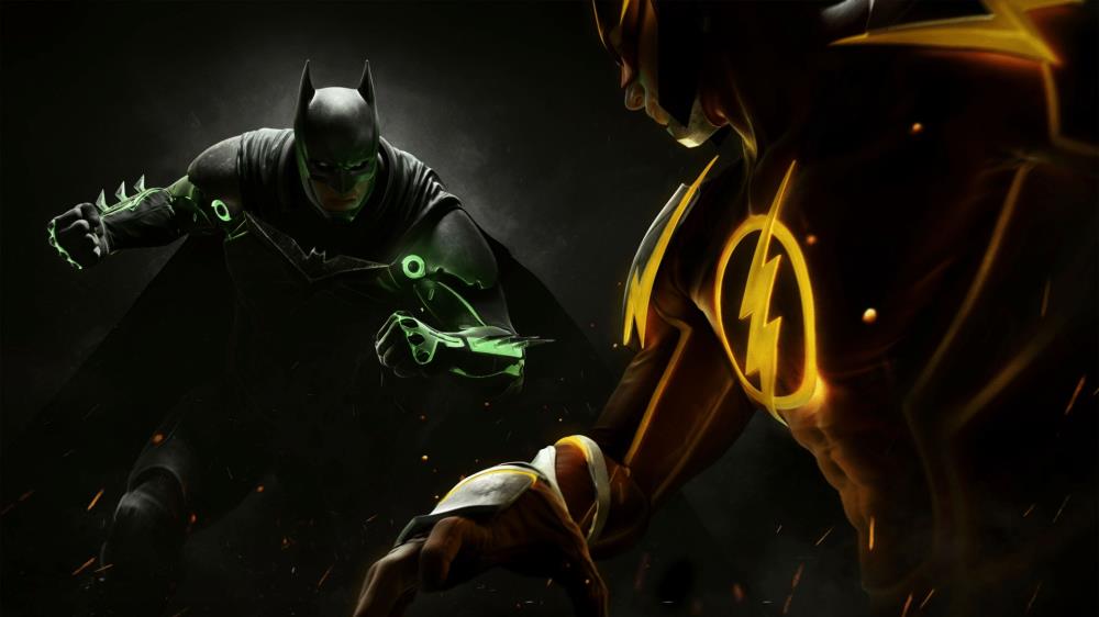
Thanks to the slip-up of an artist working on the title, we now have more evidence that a new Injustice game is in the works.


They probably had a higher build quality for display from the beginning, let's be honest.
But Nintendo's been cutting costs a lot lately... they minimized the paper in their game cases now with no manuals and printing the club nintendo codes on the back of the insert.
I don't think the toys look fast food restaurant bad though. Look better than the Skylanders or Infinity toys.
Lol at Peach's panty (bloomers?) shot.
At least it's not as bad as the AGNES statue that came with the Bravely Default Collectors Edition in Europe, right? I feel bad for people who paid for that thing. I would have bought it if it came to the US, but then I saw an unboxing, and I was glad it was removed from US CEs to reduce cost.
Why is it when I said they would be cheap looking and gimmick like I was disagreed to death.
People argued that they would be amazing quality for collectors....face it these are silly toys to try and capture the casual market like EA/Activison have done with their versions.
Hate to say I told you so....but I told you so
First off it a bit hard to compare when one image that has studio lighting an a high resolution photography and compare it to someone taking a pic with their phone. Having said that. yeah they probably wont look as good in mass production it happens.
In the production model links sword isn't even straight, it looks like its bending slightly.
And look at the production version of marth, his sword is droopy aswell: http://i.kinja-img.com/gawk...
Edit: i realize they probably had to make the swords soft so kids don't hurt themselves.