
It’s once again time for another site update. Today we uploaded some changes to the site’s navigation as well as adding a few new site features. There are about 1000 stories added to N4G each day, and since only so many can reach the front page there are tons of interesting stories getting buried away in some dark deserted corner of N4G. The navigation we had did not do a very good job of encouraging users to explore content beyond the home page, so we have completely revamped the site menu to make this easier.

New report from Skillsearch found that 22% of those surveyed had been laid off within the past 12 months.
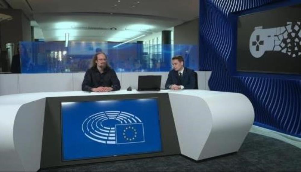
It's a step forward for Stop Killing Games.

The Callisto Protocol director thinks the solution involves the right people, the right timing, and perhaps a little bit of AI
I don't agree with that. I WISH I could agree with that. But buying habits and customer opinions prove otherwise
We've seen developers in the AAA space try new things and ideas. More often than not, the customers aren't willing to give things a chance, or not enough people buy into the project for it to grow.
Creativity works better in the indie space because the budgets, pressures, and expectations aren't the same.
it's a nice idea and it worked during the PS2/PS3-era when AAA didn't cost hundreds of millions of dollars. smaller budgets and shorter development time left room for more creativity and more risk. a game didn't need to sell 4 million+ copies to break even. things are different now.

This is the guy who bragged about crunching his staff and having them work through the night. Crunch culture has lost more talent and done more damage to the industry than any other factor. Screw him.


Just when I got used to the other look.. I get this lol. It never ends.. I now get bombarded with a truckload of colors at the homepage >.>
WTF? This is different.
I cant complain, i like the new Background
make your mind up N4G
New update is pretty cool...Just now i have to get used to this one when i was already getting used to the other one.