
Despite the original Spider-Man font which has been apart of Sony's state of the art console for almost 3 years now, the new 'PS3' brand just makes sense. Outside of being a cleaner logo image, psychologically it should resonate well in the minds of many current PS2 owners who now see the affordability and value of graduating to the 'PS3'.
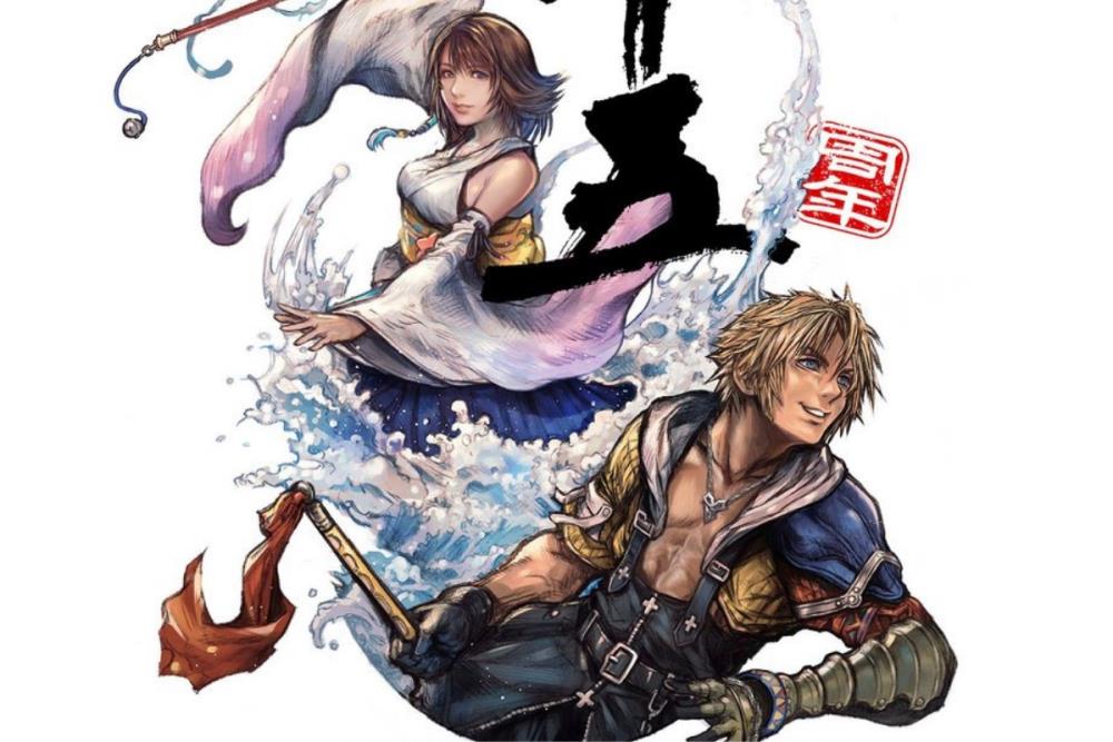
Square Enix launches Final Fantasy X 25th anniversary site, revealing new Nomura art, books, music releases, and merchandise.

Look I know VIII has its issues and all that but how on earth can the do big anniversary events with new artwork and merchandise for VII, IX and X yet VIII got sweet f*** all.
They could have given it something during its 25th anniversary yet all it got was a single Happy Anniversary post on their social media.

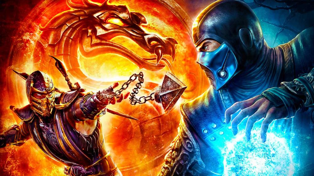
A brutal reset, a smarter story, and a return to what made it great—Mortal Kombat (2011) revived the series.


15 years went by so fast. I remember playing through the story mode at launch.

Why did Sony push Shuhei Yoshida out of his role leading PlayStation's first-party games? He'd overseen some huge successes. Well, apparently, he didn't listen.

Yeah I can see that for sure. Shuhei Yoshida should have been in charge not Jim Ryan.

More confirmation that Jim Ryan is the culprit for what has happened to Sony. Hulst needs to go too. What sucks is that a lot of the good top heads at Sony are no longer there. I wish that guys that were forced out prematurely by Dumbo Jimbo like Shuhei and Layden came back.

Makes you wonder if MS even thought about hiring him after Phil and Sarah were leaving. He certainly couldn't make their situation any worse.


All the gamer/consumer lead heads are gone across PS and Xbox. shuhei gone phil's gone (questionable) but gone. The future of gaming is somewhat uncertain across the board.


...ps2/ps3 it seems more natural
a really clever move by sony,they wanna strike people with the "playstation" feeling
cheap price+same old "ps2" litters+highly advanced system=GOLD
Console domination is just around the corner for Sony. They just have to play their cards right.
So it's the font of the regular Playstation brand but in the shape of the "PS2" logo.
ps2 roots is stupid.where they trying to get to the ps1 roots with the ps2?NO.The old ps3 image felt like an evoulution to the PS brand just like ps2 to ps1.ps4 better not be the "optical" PS3.I can see ken kuturagi being dissapointed because thats not his vision for the ps brand.