
PS3Fanboy writes: "You've all no doubt seen the original trailer for Mirror's Edge (and if not, where've you been?), which means you know the first part of this Mirror's Edge level pretty well. Looks easy, right? I thought so too, until I had my hands on the controls and I was plummeting to my death for the fifth time. Mirror's Edge looks incredibly stylish in the trailers, but it's easy to assume there's not much actual gameplay there. The reality is, this is one of the most intriguingly controlled games that you'll play this year".
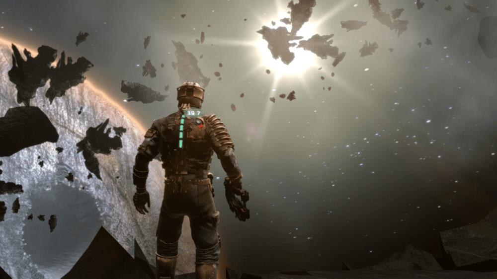
Former Visceral Games devs reveal Dead Space's marketing budget was cut in favor of Mirror's Edge because of mock review scores.

I wish EA would just release a DS2 remake. DS is my favorite horror game and DS2 is the best one in the franchise. But because DS1 failed to meet certain numbers EA scrapped the DS2 remake. SH2 remake was great rumors are Konami might be asking for another SH remake. The RE2 remake was great EA just needs to give it another try. But all they seem to do is shitty sports games that are no different from the year before. Change a few players, add different uniform colours, maybe change a team logo. Wash, rinse, repeat.
I bought Dead Space during launch window and I never bought a Mirror's Edge game .

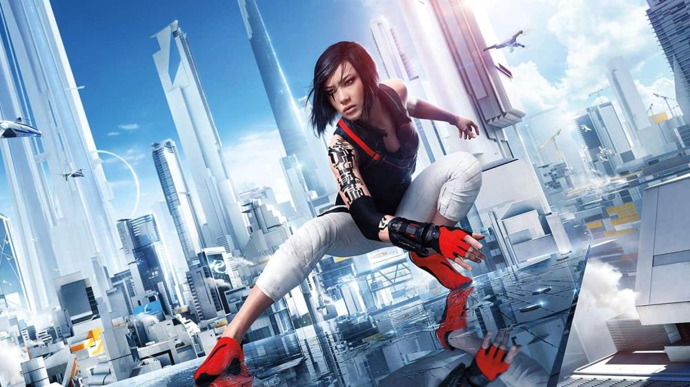
It seems that in Season 4, DICE has snuck in a Battlefield 2042 Mirror's Edge Easter egg in the new Flashpoint map.
GF365: "There are some games with extraordinary visuals that impress us to this day. Here are old games with outstanding graphics."


I always thought the first 3 Gears of War games looked great and still hold up for today.

Far Cry 2 was awesome. In addition to having demonstrably better physics and AI than later games in the series, it had a lot of design decisions that, criticized at the time, have since been praised in games like BOTW and Dark Souls.

It might not be super amazing by today's standard but I thought Mgs3 looked really good


There's one thing I don't like about this game:
It holds your hand in terms of where you need to go. Whatever is painted red, that's where you need to go to progress in the level.
I feel that's a lazy design decision, and that a much better way of going about it would be to not have such a blatantly obvious level path.
This game is about Parkour, and anyone who knows even one shred about parkour, knows that there is no "set way" of going througha particular area. It's all about improvising and choosing your own way around the environment.
If you're going to make a game with Parkour at center stage, then please get rid of the painted level paths.
Anyone could easily look at a usable piece of the environment and see that as a logical way to proceed further. I don't need that pole over there painted red to see that I can swing under it or vault over it.
Leave some decisions to the player, and you will be greatly rewarded with praises of level non-linearity.
Oh well then hell yeah at least it's optional!
Good good, that made me very happy thor lol
+ bubble
as long as you can look down and see some cleavage, I'm down. Then again she's chinese. OHHH SNAP!