
(An editorial piece on the Xbox 360 Dashboard) On the eve of E3, The Fanboys muse on what a reboot of the Xbox 360 dashboard could look like, and how it could improve your experience with your console.
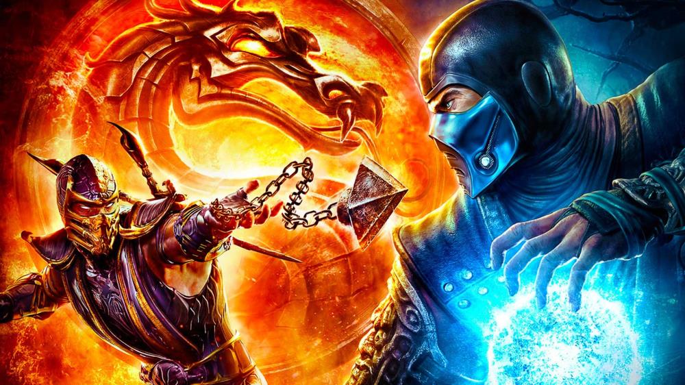
A brutal reset, a smarter story, and a return to what made it great—Mortal Kombat (2011) revived the series.


15 years went by so fast. I remember playing through the story mode at launch.
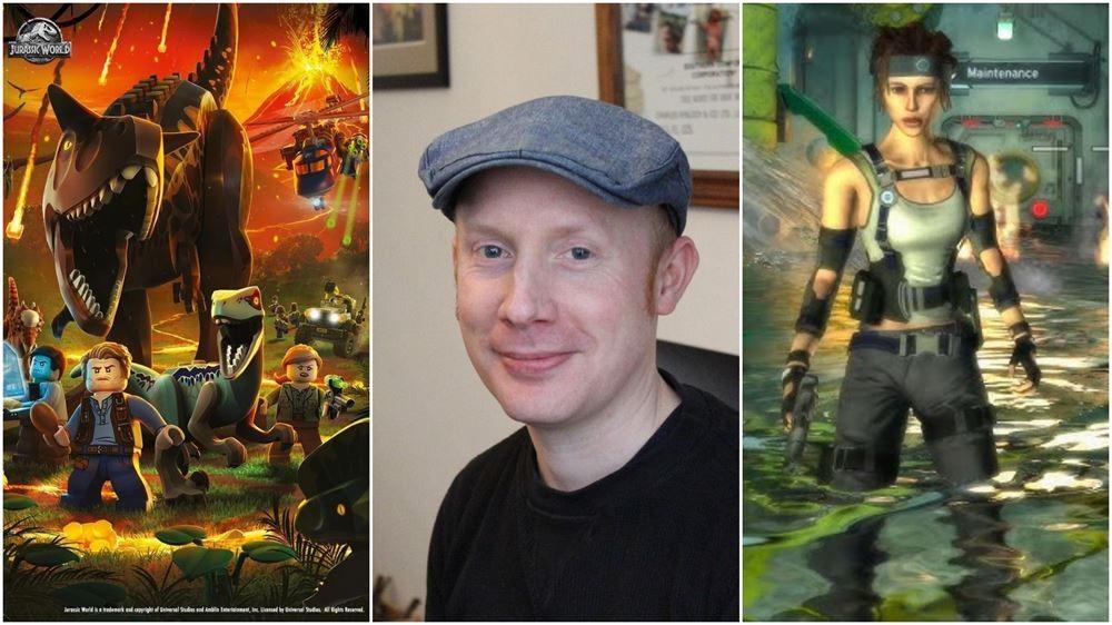
The name "Hewson" carries a special weight for anyone who grew up during the golden age of British computing. As the son of Andrew Hewson—the man behind legendary publisher Hewson Consultants—Rob Hewson didn't just grow up playing video games; he learned to spell his name from their title screens. However, Rob didn't just rest on his family's 8-bit laurels. From leading major LEGO franchises at TT Games to tackling the high-stakes world of technical porting at Huey Games, Rob has carved out a unique path in an ever-evolving industry. In this candid interview Rob to discussed the burden and beauty of a family legacy, the technical "scar tissue" left by the ambitious Hydrophobia, and why porting a masterpiece like Inscryption to consoles is far more than a simple copy-paste job.
To celebrate Tomb Raider: Legend's 20th anniversary, the official channels have shared an early in-development gameplay demo.




The Blades are meant to resemble the Consoles curves,so unless Microsoft are going to unveil a redesigned Xbox 360,the Dash won't be changing anytime soon.
Keep the dream alive though,with enough articles on the necessary improvements the Dash has to undergo,Microsoft are sure to start listening!
I really like the design he showed us. I like the wallpaper idea not being obscured by the blade system themselves. Even if you do buy one of those neat themes all the other stuff clutters and obscures your view of the theme itself.
Hope you are taking notes, Microsoft.
its a nice idea and i like his suggested new look. The current one does already show you what's in tray though, and Y is mapped to something but apart from that he's spot on. Allt he wasted space could be used better and his design stops things overlapping each other.
I agree that the 360 dashboard is in need of an overhaul but his design is too cluttered.
The dash needs to be redone - if only from a performance point of view.
But i think we'd all like to see it tuned for HDTVs, smaller fonts, less clutter, cleaner ins & outs and less digging down to find what we want (use a standardised 'start' button to play games/films/etc from the top level that you see them from, or to join in mate's games (like x for invite)
I like that article, points things out well, well considered options if not entirely up to date but i'm not fond of his style, though i appreciate what he's done in the mockup.
There's a reason there was no spring update, i hope there's something come E3, or something gigantic in autumn.