a video which takes a look at the differences between the 2004 release of Fable with the updated Fable Anniversary which is due to hit the Xbox 360 from the 4th of February 2014.

The Outerhaven writes: Being fans of Fable, we decided to do an in-depth retrospective on the Fable franchise, exploring its choices, consequences, tone, and lasting impact on RPG design.

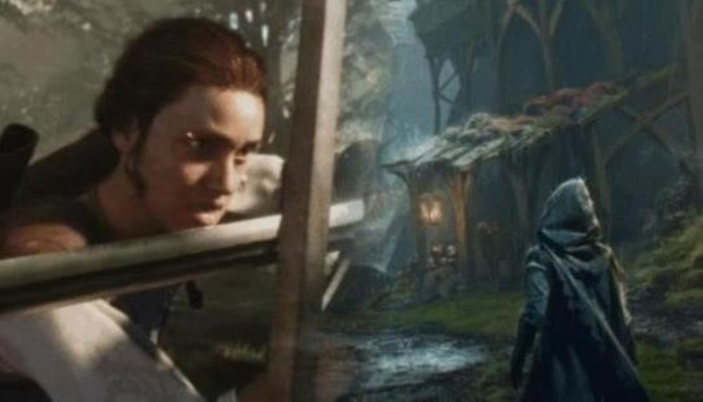
As we approach the new Xbox Direct, we reveal never-before-seen Fable concept art featuring werewolves, the return of Bloodstone, and more.


If they keep that ugly ass protagonist they can count me out... Don't have to be Stellar Blade level because it would even fit the mood of the game, and frankly it is a bit exaggerated, but could be at least presentable.
I hope the do away with the main characters model. It is ugly and looks neither male nor female which is disgusting. It may prevent me from purchasing it is really a product of woke bs.

I won't get hyped because I got hyped for Perfect Dark and I saw what happened there. Perfect Dark would have been freakin sweet.
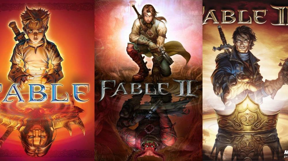
The Outerhaven writes: An in-depth retrospective on the Fable franchise, exploring its choices, consequences, tone, and lasting impact on RPG design.


Honestly all devs need to use Halo and fable anniversary as an example for how to make a remake/remaster.
looks excellent.
Is it strange for me to like the old one in this comparison? The face of the little kid just looks weird in Anniversary and the lighting seems quite 'boring'. I miss the vibrant colors here, which really set the atmosphere for me in Fable. This was also one of the reasons why I think I disliked 3 so much.
Other than that it looks to be an amazing remake.
Oh god what? The game looks terrible now, The bright world was perfect, it made everything that was evil or dark that much darker.
And now the character models also look worse.
Who approved this remake?
Is that screen-tearing? Face and bleakness is a shame, but I'd still buy this on the double for PC.